css实现两栏固定中间自适应
1、利用绝对定位和margin
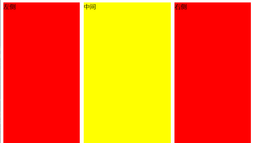
此方法的原理说将左右两侧进行定位,让其脱离文档流。 中心区域自然流动到它们下面,再为其设置margin值
此方法页面元素结构可以顺序可以随意变动, 注意top值需要进行处理,不然可能会出现对不齐现象
HTML
1
2
3
4
5
| <div id='container'>
<div class='left'>左侧</div>
<div class='center'>中间</div>
<div class='right'>右侧</div>
</div>
|
CSS
1
2
3
4
5
6
7
8
9
10
11
12
13
14
15
16
17
18
19
20
21
| #container {
position: relative;
}
.left, .right{
position: absolute;
top: 0;
width: 200px;
min-height: 500px;
background-color: red;
}
.left {
left: 0;
}
.right {
right: 0;
}
.center {
margin: 0px 210px;
min-height: 500px;
background-color: yellow;
}
|
2、利用浮动和margin
此方法的原理说将左右两侧进行float 浮动让其脱离文档流,中心部分处于正常文档流,再为其设置margin值
此方法一定要将center中间部分放到最后,当窗口特别小时右侧会被挤下来
HTML
1
2
3
4
5
| <div id='container'>
<div class='left'>左侧</div>
<div class='right'>右侧</div>
<div class='center'>中间</div>
</div>
|
CSS
1
2
3
4
5
6
7
8
9
10
11
12
13
14
15
16
17
18
19
| #container {
position: relative;
}
.left, .right {
width: 200px;
min-height: 500px;
background-color: red;
}
.left {
float: left;
}
.right {
float: right;
}
.center {
min-height: 500px;
margin: 0px 210px;
background-color: yellow;
}
|
3、CSS3 flex
HTML
1
2
3
4
5
| <div id='container'>
<div class='left'>左侧</div>
<div class='center'>中间</div>
<div class='right'>右侧</div>
</div>
|
CSS
1
2
3
4
5
6
7
8
9
10
11
12
13
14
15
| #container {
width: 100%;
display: flex;
}
.left, .right {
width: 200px;
background-color: red;
min-height: 500px;
}
.center {
flex: 1;
min-height: 500px;
margin: 0 10px;
background-color: yellow;
}
|
参考文章
css实现两栏固定中间自适应