首页轮播图
- 第三方轮播插件使用
Github地址
vue-awesome-swiper
安装:项目文件夹路径中,这里我们安装的是@2.6.7版本,其他版本可能兼容性等问题
1
| npm install swiper vue-awesome-swiper@2.6.7 --save
|
- 引用(这里我们引用到全局中,因为各个页面可能都会使用)
main.js
1
2
3
4
5
6
7
8
9
10
11
| import Vue from 'vue'
import VueAwesomeSwiper from 'vue-awesome-swiper'
//这里我们使用这个版本
// import style (>= Swiper 6.x)
import 'swiper/swiper-bundle.css'
// import style (<= Swiper 5.x)
import 'swiper/css/swiper.css'
Vue.use(VueAwesomeSwiper, /* { default options with global component } */)
|
- 使用
Swiper.vue
1
2
3
4
5
6
7
8
9
10
11
12
13
14
15
16
17
18
19
20
21
22
23
24
25
26
27
28
29
30
31
32
33
34
35
36
37
38
39
40
41
42
43
44
45
46
47
| <template>
<div class="wrapper">
<swiper :options="swiperOptions" v-if="showSwiper">
<swiper-slide v-for="item of list" :key="item.id">
<img class="swiper-img" :src="item.imgUrl" alt="" />
</swiper-slide>
<div class="swiper-pagination" slot="pagination"></div>
</swiper>
</div>
</template>
<script>
export default {
name: "HomeSwiper",
props: {
list: Array
},
data() {
return {
swiperOptions: {
pagination: ".swiper-pagination",
loop: true
}
};
},
computed: {
showSwiper() {
return this.list.length;
}
}
};
</script>
<style lang="stylus" scoped>
// 样式穿透,不受scoped控制了
.wrapper >>> .swiper-pagination-bullet-active
background:#fff
.wrapper
overflow hidden
width:100%
height:0
padding-bottom :31.25%
background :#eee
.swiper-img
width:100%
</style>
|
占位
图片是可替代资源,在页面显然时,会先将页面中静态的内容渲染上去,等数据返回后,在进行重新渲染,这样页面就会出现抖动,影响用户体验,同时性能也比较低。
可以用下面的css代码对这些可替换资源先进行占位,页面大体框架在第一次渲染后就能呈现给用户,数据获取到后,替换相应的内容就可,就不会出现抖动了。
1
2
3
4
5
| .icon-img
overflow: hidden
width: 100%
height: 0
padding-bottom: 100%
|

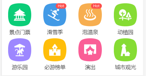
图标区域页面布局
新建一个组件
src\pages\home\components\Icons.vue
在Home.vue中引入并使用
icons.vue代码
1
2
3
4
5
6
7
8
9
10
11
12
13
14
15
16
17
18
19
20
21
22
23
24
25
26
27
28
29
30
31
32
33
34
35
36
37
38
39
40
41
42
43
44
45
46
47
48
49
50
51
52
53
54
55
56
57
58
59
60
61
62
63
64
65
66
67
68
69
70
71
72
73
74
75
76
77
78
79
80
81
82
83
84
| <template>
<div class="icons">
<swiper :options="swiperOptions">
<swiper-slide v-for="(page, index) of pages" :key="index">
<div class="icon" v-for="item of page" :key="item.id">
<div class="icon-img">
<img class="icon-img-content" v-bind:src="item.imgUrl" alt="" />
</div>
<p class="icon-desc">{{ item.desc }}</p>
</div>
</swiper-slide>
</swiper>
</div>
</template>
<script>
export default {
name: "HomeIcons",
props: {
list: Array
},
data() {
return {
swiperOptions: {
autoplay: false
}
};
},
computed: {
pages() {
const pages = [];
this.list.forEach((item, index) => {
const page = Math.floor(index / 8);
if (!pages[page]) {
pages[page] = [];
}
pages[page].push(item);
});
return pages;
}
}
};
</script>
<style lang="stylus" scoped>
@import '~styles/varibles.styl';
@import '~styles/mixins.styl';
.icons >>> .swiper-container
width:100%
height:0
padding-bottom:50%
.icons
margin-top:.1rem
.icon
position :relative
overflow :hidden
float:left
width:25%
height:0
padding-bottom :25%
.icon-img
position:absolute
top:0
left:0
right:0
bottom:.44rem
box-sizing:border-box
padding:.1rem
.icon-img-content
display:block
margin 0 auto
height:100%
.icon-desc
position :absolute
left:0
right:0
bottom:0
height:.44rem
line-height :.44rem
color:#darkTextColor
text-align :center
ellipsis()
</style>
|
文字太长后面文字用….表示的Css样式
1
2
3
| overflow :hidden
white-space :nowrap
text-overflow :ellipsis
|
由于这个样式很多地方都会用到,所以我们可以借助stylus的mixins.styl将它封装.
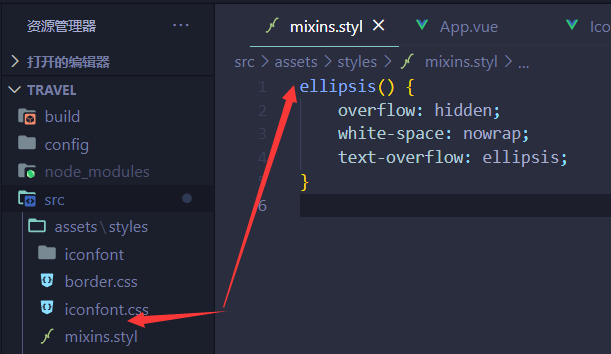
使用:
导入
1
| @import '~styles/mixins.styl';
|
css中使用
推荐组件开发
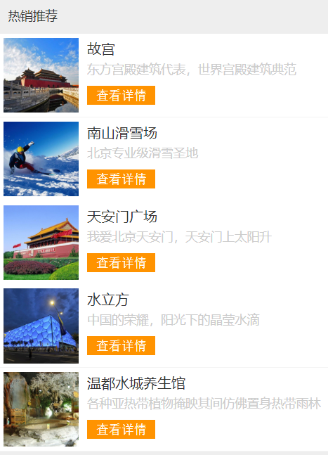
新建一个组件
src\pages\home\components\Recommend.vue
在Home.vue中引入并使用
Recommend.vue代码
1
2
3
4
5
6
7
8
9
10
11
12
13
14
15
16
17
18
19
20
21
22
23
24
25
26
27
28
29
30
31
32
33
34
35
36
37
38
39
40
41
42
43
44
45
46
47
48
49
50
51
52
53
54
55
56
57
58
59
60
61
62
63
64
| <template>
<div>
<div class="title">
热销推荐
</div>
<ul>
<li class="item border-bottom" v-for="item of list" :key="item.id">
<img class="item-img" :src="item.imgUrl" alt="" />
<div class="item-info">
<p class="item-title">{{ item.title }}</p>
<p class="item-desc">{{ item.desc }}</p>
<button class="item-button">查看详情</button>
</div>
</li>
</ul>
</div>
</template>
<script>
export default {
name: "HomeRecommend",
props: {
list: Array
}
};
</script>
<style lang="stylus" scoped>
@import '~styles/mixins.styl';
.title
margin-top :.2rem
line-height :.8rem
background:#eee
text-indent:.2rem
.item
overflow: hidden
display:flex
height :1.9rem
.item-img
width 1.7rem
height 1.7rem
padding:.1rem
.item-info
flex:1
padding:.1rem
min-width:0
.item-title
line-height :.54rem
font-size :.32rem
ellipsis()
.item-desc
line-height :.4rem
color:#ccc
ellipsis()
.item-button
line-height :.44rem
margin-top:.16rem
background #ff9300
padding:0 .2rem
border radius 0.06rem
color:#fff
</style>
|
周末游组件开发
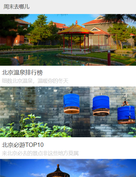
新建一个组件
src\pages\home\components\Weekend.vue
在Home.vue中引入并使用
Weekend.vue代码
1
2
3
4
5
6
7
8
9
10
11
12
13
14
15
16
17
18
19
20
21
22
23
24
25
26
27
28
29
30
31
32
33
34
35
36
37
38
39
40
41
42
43
44
45
46
47
48
49
50
51
52
| <template>
<div>
<div class="title">
周末去哪儿
</div>
<ul>
<li class="item border-bottom" v-for="item of list" :key="item.id">
<div class="item-img-warpper">
<img class="item-img" :src="item.imgUrl" alt="" />
</div>
<div class="item-info">
<p class="item-title">{{ item.title }}</p>
<p class="item-desc">{{ item.desc }}</p>
</div>
</li>
</ul>
</div>
</template>
<script>
export default {
name: "HomeWeekend",
props: {
list: Array
}
};
</script>
<style lang="stylus" scoped>
@import '~styles/mixins.styl';
.title
line-height :.8rem
background:#eee
text-indent:.2rem
.item-img-warpper
overflow:hidden
height:0
padding-bottom :37.9%
.item-img
width 100%
.item-info
padding:.1rem
.item-title
line-height :.54rem
font-size :.32rem
ellipsis()
.item-desc
line-height :.4rem
color:#ccc
ellipsis()
</style>
|