以下是对flex布局的学习(重点)
flex布局体验
布局原理
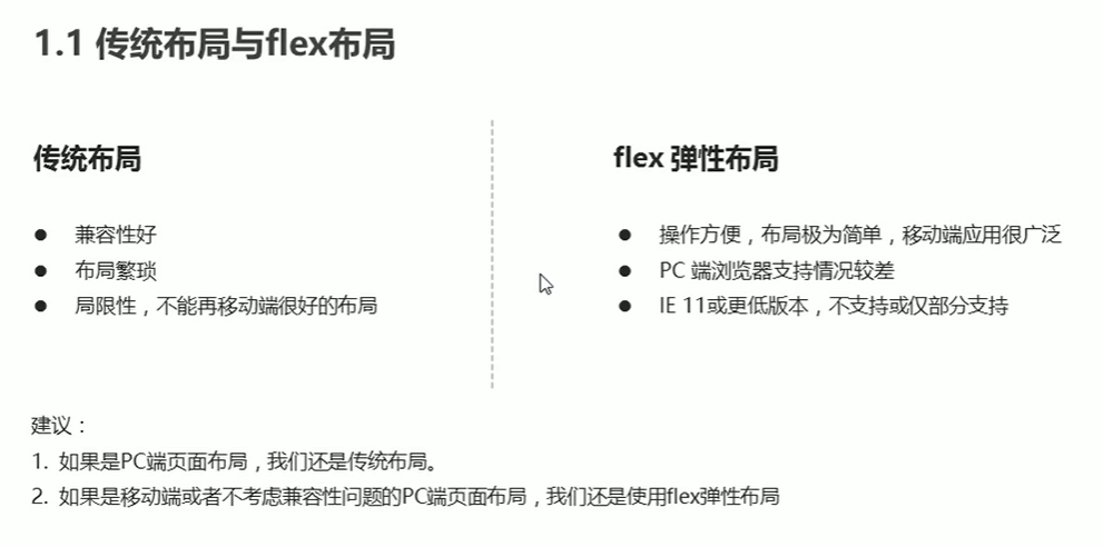
flex 是flexible Box的缩写,意为“弹性布局”,用来为盒状模型提供最大的灵活性,任何一个容器都可以指定为flex布局。
- 当我们为父盒子设为flex布局以后,子元素的float,clear和vertical-align属性将无效
- 伸缩布局=弹性布局=伸缩盒布局=弹性盒布局=flex布局
flex布局布局原理:就是通过给父盒子添加flex属性,来控制子盒子的位置和排列方式
常见父项属性
以下由6个属性是对父元素设置的
- flex-direction: 设置主轴的方向
- justify-content: 设置主轴上的子元素排列方式
- flex-warp: 设置子元素是否换行
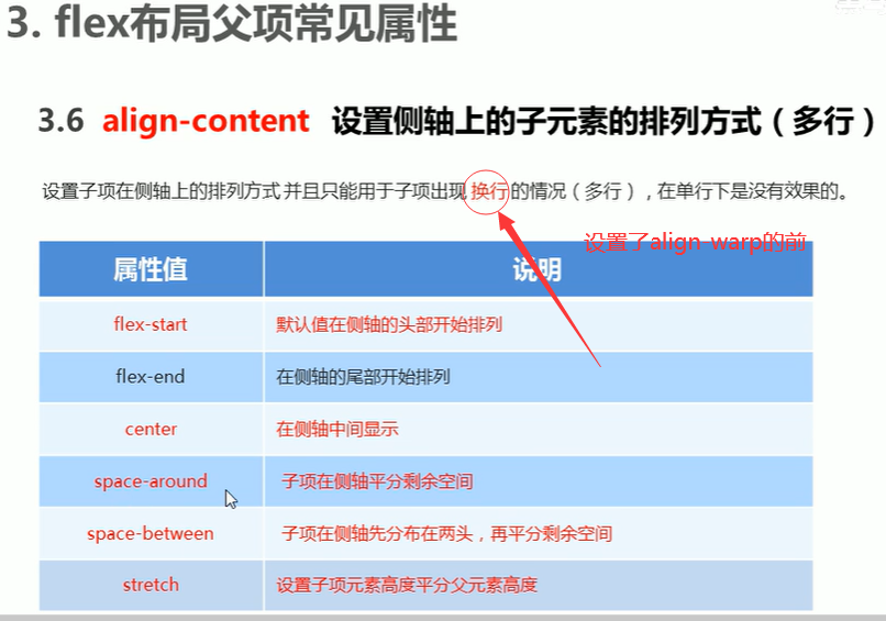
- align-content:设置侧轴上的子元素排列方式(多行)
- align-items:设置侧轴上的子元素排列方式(单行)
- flex-flow: 符合属性,相当于同时设置了flex-direction和flex-warp
flex-direction: 设置主轴的方向
1
2
3
4
5
6
7
8
9
10
11
12
13
14
15
16
17
18
19
20
21
22
23
24
25
26
| <style>
div {
display: flex;
width: 80%;
height: 300px;
background-color: pink;
}
div span {
width: 150px;
height: 100px;
background-color: red;
}
</style>
<body>
<div>
<span>1</span>
<span>2</span>
<span>3</span>
</div>
|
justify-content 设置主轴上的子元素排列方式
注意:使用这个属性之前一定要确定好主轴是哪个
1
2
3
4
5
6
7
8
9
10
11
12
13
14
15
16
17
18
19
20
21
22
| div {
display: flex;
width: 800px;
height: 300px;
background-color: pink;
/* 默认的主轴是x轴row */
flex-direction: row;
/*默认值,从头部开始,如果主轴是x轴,则从左到右 */
/* justify-content: flex-start; */
/* 从尾部开始 */
/* justify-content: flex-end; */
/* 让我们子元素居中对齐 */
/* justify-content: center; */
/* 平分剩余空间 */
/* justify-content: space-around; */
/* 先两边贴边,在分配剩余的空间 */
/* justify-content: space-between; */
}
|
flex-wrap: wrap 设置子元素是否换行
1
2
3
4
5
6
7
8
9
10
11
12
13
14
15
16
17
18
| div {
display: flex;
width: 600px;
height: 400px;
background-color: pink;
}
div span {
width: 150px;
height: 100px;
background-color: purple;
color: white;
margin: 10px;
}
|
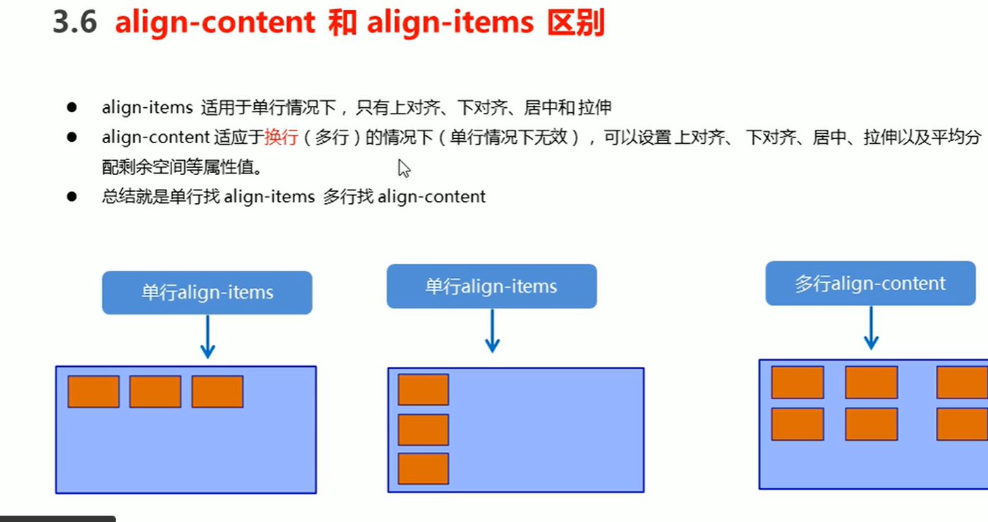
align-items 设置侧轴上的子元素排列方式(单行)
该属性是控制子项在侧轴(默认是y轴)上的排列方式,在子项为单项的时候使用
1
2
3
4
5
6
7
8
9
10
11
12
13
| display: flex;
/* 我们是需要一个侧轴居中 */
align-items: center;
/* 从上到下 */
/* align-items: flex-start; */
/* 从下到上 */
/* align-items: flex-end; */
/*拉伸,但是子盒子不要给高度 */
/* align-items: stretch; */
|
align-content 设置侧轴上的子元素的排列方式(多行)
1
2
3
4
5
6
7
8
9
10
11
12
13
14
| div {
display: flex;
width: 800px;
height: 400px;
background-color: pink;
flex-wrap: wrap;
align-content: center;
}
|
align-content 和align-items区别
flex-flow
flex-flow 属性是flex-direction和flex-wrap 属性的复合属性
1
2
3
4
|
flex-flow: column wrap;
|
flex布局子项常见属性
- flex子项目占的分数
flex属性定义子项目分配剩余空间,用flex来表示占多少份数
1
2
3
4
5
6
7
8
9
10
11
12
13
14
15
16
17
18
19
20
21
22
23
24
25
26
27
28
29
30
31
| <style>
section {
display: flex;
width: 60%;
height: 150px;
background-color: pink;
margin: 0 auto;
}
section div:nth-child(1) {
width: 100px;
height: 150px;
background-color: red;
}
section div:nth-child(2) {
flex: 1;
background-color: green;
}
section div:nth-child(3) {
width: 100px;
height: 150px;
background-color: blue;
}
</style>
<body>
<section>
<div></div>
<div></div>
<div></div>
</section>
</body>
|
- align-self 控制子项自己在侧轴上的排列方式(了解)
1
2
3
4
5
6
7
8
9
10
11
12
13
14
15
16
17
18
19
20
21
22
23
24
25
26
27
| <style>
div {
display: flex;
width: 80%;
height: 300px;
background-color: pink;
}
div span {
width: 150px;
height: 100px;
background-color: purple;
margin-right: 5px;
}
div span:nth-child(3) {
align-self: flex-end;
}
</style>
<body>
<div>
<span>1</span>
<span>2</span>
<span>3</span>
</div>
</body>
|
- order 属性定义项目的排列顺序(了解)
数值越小,排列越靠前,默认为0
注意:和z-index不一样
1
2
3
| div span:nth-child(2) {
order: -1;
}
|