以下是对CSS(浮动,父级边框塌陷问题,定位)的学习(重点)
边框
边框的粗细,样式,颜色( border: 1px solid red;)
1
2
3
4
5
6
7
8
9
10
11
12
13
14
15
16
17
18
19
20
21
22
23
24
25
26
27
28
29
30
31
| <style>
h1, ul, li, a,body {
margin: 0;
padding: 0;
text-decoration: none;
}
#box {
width: 300px;
border: 1px solid red;
}
h2 {
font-size: 16px;
background-color: #3cbda6;
line-height: 30px;
color: white;
}
form {
background: #3cbda6;
}
div:nth-of-type(1) input {
border: 3px solid black;
}
div:neh-of-type(2) iniput {
border: 3px dashed #4d0b8c;
}
div:neh-of-type(3) iniput {
border: 2px dashed #008c27;
}
</style>
|
内外边距及边框居中
1
2
3
4
5
| margin: 0 auto;外边距的妙用,居中元素
margin:10px 5px 15px 20px;(上右下左)--顺时针
margin:10px 5px;上下10px,左右 5px
margin:10px 5px 15px;上外边距是10px,左右5px,下外边距是15px
margin:10px;所有 4 个外边距都是 10px
|
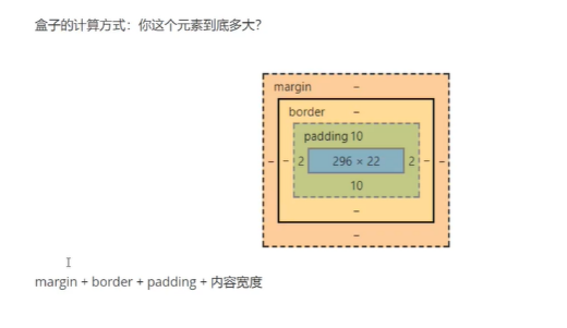
盒子大小计算方式
圆角边框
4个角
1
2
3
4
5
6
7
8
9
10
11
12
|
<style>
div {
width: 100px;
height: 100px;
border: 10px solid red;
border-radius: 100px;
}
</style>
|
盒子阴影(box-shadow)
1
2
3
4
5
6
7
8
9
10
11
12
13
14
| <style>
div {
margin: 0 auto;
border-radius: 50px;
box-shadow: 10px 10px 1px yellow;
}
</style>
box-shadow: h-shadow v-shadow blur spread color inset;
h-shadow 必需。水平阴影的位置。允许负值。
v-shadow 必需。垂直阴影的位置。允许负值。
blur 可选。模糊距离。
spread 可选。阴影的尺寸。
color 可选。阴影的颜色。请参阅 CSS 颜色值。
inset 可选。将外部阴影 (outset) 改为内部阴影。
|
模仿网站思路
网页链接
视频后半部分讲解
浮动
标准文档流
块级元素: 独占一行
行内元素: 不占一行
display
这个也是一种实现行内元素排列的方式,但是我们很多情况都是float
1
2
3
4
5
6
7
8
9
10
11
12
13
14
15
16
17
18
19
20
|
<style>
div {
width: 100px;
height: 100px;
border: 1px solid red;
display: none;
}
span {
width: 100px;
height: 100px;
border: 1px solid red;
display: inline-block;
}
</style>
|
float
左右浮动 float
1
2
3
4
5
6
7
8
9
10
11
12
13
14
15
16
17
18
19
20
21
22
23
24
25
26
27
28
29
| div {
margin: 10px;
padding: 5px;
}
#father {
border: 1px #000 solid;
overflow: auto;
}
#father::after {
content: '';
display: block;
clear: both;
}
.layer01 {
border: 1px #00f dashed;
display: inline-block;
float: left;
}
.layer02 {
border: 1px #00f dashed;
display: inline-block;
float: left;
}
.layer03 {
border: 1px #00f dashed;
display: inline-block;
float: right;
}
|
对比
- display 方向不可以控制
- float 浮动起来的话会脱离标准文档流,所以要解决父级边框塌陷的问题
父级边框塌陷问题
clear1
2
3
4
5
| /* clear: right; 右侧不允许有浮动元素
clear: left; 左侧不允许有浮动元素
clear: both; 两侧不允许有浮动元素
clear: none 默认值。允许浮动元素出现在两侧。
*/
|
- 增加父级元素的高度~
1
2
3
4
| #father {
border: 1px #000 solid;
height: 800px;
}
|
- 增加一个空的div标签,清除浮动
1
2
3
4
5
6
| <div class="clear"></div>
.clear {
clear: both;
margin: 0;
padding: 0;
}
|
- overflow
1
| 在父级元素中添加一个 overflow:hidden;
|
- 父类添加一个伪元素 ::after
1
2
3
4
5
| #father::after {
content: '';
display: block;
clear: both;
}
|
定位
1.相对定位 position: relative;
相对原来自己的位置,进行指定的偏移,相对定位的话,它仍然在标准文档流中,原来的位置会被保留。
1
2
3
4
| top: -20px;上
left:20px;左
bottom:-10px;下
right: 20px;右
|
1
2
3
4
5
6
7
8
9
10
11
12
13
14
15
16
17
18
19
20
21
22
23
24
25
26
27
28
29
30
31
|
<style>
div {
margin: 10px;
padding: 5px;
font-size: 12px;
line-height: 25px;
}
#father {
border: 1px solid #666;
padding: 0;
}
#first {
border: 1px dashed rgb(35, 204, 50);
background-color: cyan;
position: relative;
top: -20px;
left: 20px;
}
#second {
border: 1px dashed rgb(16, 58, 194);
background-color: blue;
position: relative;
bottom: -10px;
}
#third {
border: 1px dashed rgb(167, 46, 92);
background-color: chartreuse;
}
</style>
|
2. 绝对定位 position: absolute;
定位: 基于xxx定位,上下左右~
- 没有父级元素定位的前提下,相对于浏览器定位
- 假如父级元素存在定位,我们通常会相对于父级元素进行偏移
- 在父级元素范围内移动
相对于父级或浏览器的位置,进行指定的偏移,绝对定位的话,它不在标准文档流中,原来的位置不会被保留。
1
2
3
4
5
6
7
8
9
10
11
12
13
14
15
16
17
18
19
20
21
22
23
24
25
26
27
28
29
30
31
32
33
34
| <style>
div {
margin: 10px;
padding: 5px;
font-size: 12px;
line-height: 25px;
}
#father {
border: 1px solid #666;
padding: 0;
position: relative;
}
#first {
border: 1px dashed rgb(35, 204, 50);
background-color: cyan;
}
#second {
border: 1px dashed rgb(16, 58, 194);
background-color: blue;
position: absolute;
right: 30px;
}
#third {
border: 1px dashed rgb(167, 46, 92);
background-color: chartreuse;
}
</style>
<body>
<div id="father">
<div id="first">第一个盒子</div>
<div id="second">第二个盒子</div>
<div id="third">第三个盒子</div>
</div>
</body>
|
3.固定定位 position: fixed;
1
2
3
4
5
6
7
8
9
10
11
12
13
14
15
16
17
18
19
20
21
22
23
| <style>
body {
height: 1000px;
}
div:nth-of-type(1) {
width: 100px;
height: 100px;
background: red;
position: absolute;
right: 0;
bottom: 0;
}
div:nth-of-type(2) {
width: 50px;
height: 50px;
background: yellow;
position: fixed;
right: 0;
bottom: 0;
}
</style>
|
4. z-index
图层~
z-index: 默认是0,最高~999(z-index 属性设置元素的堆叠顺序。拥有更高堆叠顺序的元素总是会处于堆叠顺序较低的元素的前面。)
注释:元素可拥有负的 z-index 属性值。
注释:Z-index 仅能在定位元素上奏效(例如 position:absolute;)!
1
2
3
4
5
6
7
8
9
10
11
12
| <link rel="stylesheet" href="style/style.css" />
<body>
<div id="content">
<ul>
<li><img src="images/1.png" alt="" /></li>
<li class="tipText">学习CSS</li>
<li class="tipBg"></li>
<li>时间:2021-1-23</li>
<li>地点:月球一号基地</li>
</ul>
</div>
</body>
|
opacity: 0.5;背景透明度
1
2
3
4
5
6
7
8
9
10
11
12
13
14
15
16
17
18
19
20
21
22
23
24
25
26
27
28
29
30
31
32
33
34
35
| #content {
width: 304px;
padding: 0px;
margin: 0px;
overflow: hidden;
font-size: 12px;
line-height: 25px;
border: 1px black solid;
}
ul,
li {
padding: 0px;
margin: 0px;
list-style: none;
}
#content ul {
position: relative;
}
.tipText,
.tipBg {
position: absolute;
width: 304px;
height: 25px;
top: 164px;
}
.tipText {
color: white;
z-index: 999;
}
.tipBg {
background: black;
opacity: 0.5;
}
|
动画及视野拓展
学习视频地址